On the second dialog box, select the file countries.sf6:
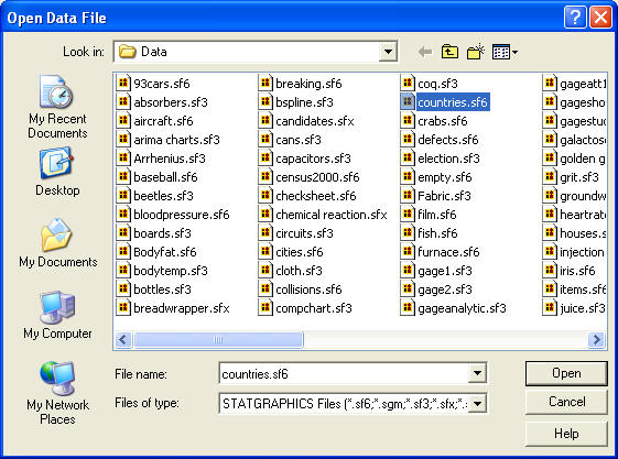
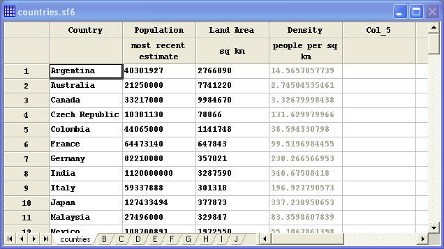
Then press Open to load it into the datasheet, as shown below:
Tutorial #4 - Analyzing Data
This tutorial illustrates how to run a statistical procedure to analyze data contained in a data file.
On the second dialog box, select the file countries.sf6:
Then press Open to load it into the datasheet, as shown below:
- The name of a column such as Density.
- An algebraic expression involving one or more columns, such as Population / Land Area (if the Density column did not already exist).
- A mathematical transformation such as SQRT(Population), using one or more predefined STATGRAPHICS operators.
Data input dialog boxes also contain a Select field that allows users to analyze a subset of the data. Typical entries in the Select field include:
- Operators such as FIRST(10) which selects only the first 10 rows.
- Expressions such as Population > 1000000 or Population > 1000000 & Population <= 10000000 which selects only those rows for which the expression is true.
A detailed discussion of valid entries in these fields are contained in STATGRAPHICS Operators.pdf.
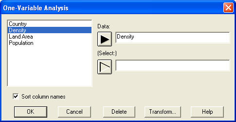
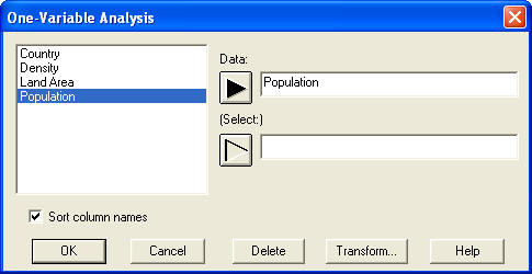
Enter Density in the data field and leave the Select field blank, which will analyze all of the rows in the datasheet. Press OK.
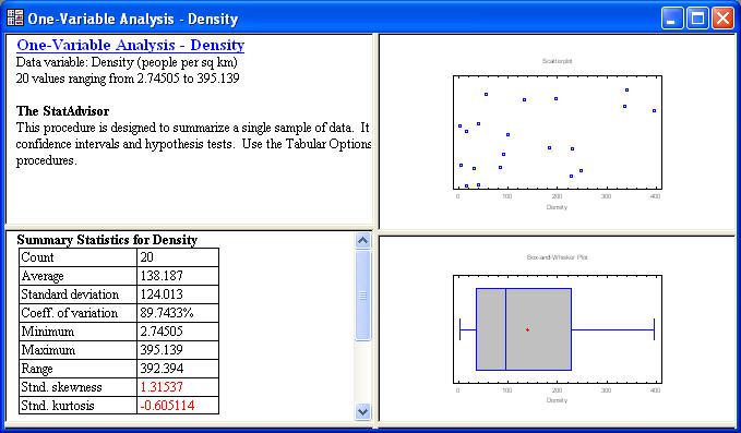
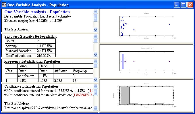
The window contains 4 “panes”, divided by movable splitter bars. The two panes on the left display tabular output, while the two panes on the right display graphical output.
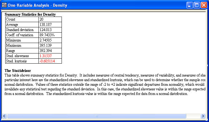
Several interesting statistics are given in the table. Of the n = 20 countries, population density ranges between 2.75 and 395.14 people per square kilometer. The average density is 138.19.
Beneath the table is the output of the StatAdvisor, which gives a short interpretation of the results. In this case, the StatAdvisor concentrates on the two statistics displayed in red, which measure the skewness and kurtosis in the data. As explained by the StatAdvisor, data that come from a normal or Gaussian distribution should yield standardized skewness and standardized kurtosis values between –2 and +2. In this case, both statistics are within that range, indicating that a bell-shaped normal curve is a reasonable model for the observations.
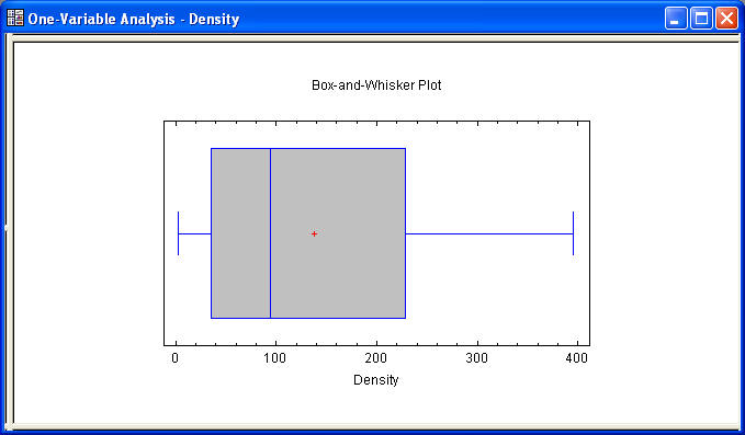
Double-click on the summary statistics table again to restore the original split display. Then double-click on the bottom right pane to maximize the box-and-whisker plot:
The box-and-whisker plot, invented by John Tukey, provides a 5-number summary of a data sample. The central box covers the middle half of the data, extending from the lower quartile to the upper quartile. The lines extending above and below the box (the whiskers) show the location of the smallest and largest data values. The median of the data is indicated by the vertical line within the box, while the plus sign (+) shows the location of the sample mean. The fact that the upper whisker is somewhat longer than the lower, while the mean is somewhat greater than the median, is a sign of possible skewness in the data, although the small sample size resulted in a standardized skewness value that was not significant.
Along the top of the analysis window is the analysis toolbar:
The buttons on the analysis toolbar are very important. The actions of the 7 leftmost buttons are summarized below:
Name
Function
Input dialog
Displays the data input dialog box so that the selected data column(s) may be changed.
Tables
Displays a list of other tables that may be created.
Graphs
Displays a list of other graphs that may be created.
Save results
Allows calculated statistics to be saved to columns of a datasheet.
Analysis options
Selects options that apply to all tables and graphs in the current analysis.
Pane options
Selects options that apply only to the currently maximized table or graph.
Graphics options
Allows you to change the titles, scaling, and other features of the currently maximized graph.
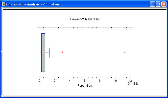
For example, press the leftmost button to display the original data input dialog box and change the data field to Population as shown below:
The resulting box-and-whisker plot is even more skewed than before. In this case, two "far outside" points are plotted as separate point symbols, with the upper whisker extending out to the greatest of the other data values.
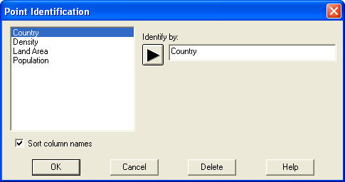
 on the analysis toolbar, select
Country on the Point Identification dialog box, and press
OK:
on the analysis toolbar, select
Country on the Point Identification dialog box, and press
OK:
Note that India has the largest population in the sample, followed by the United States.
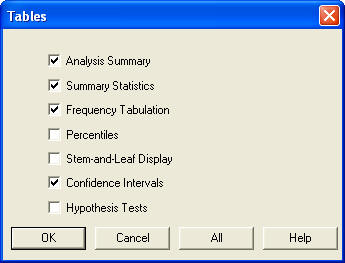
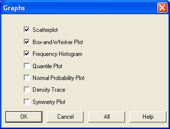
 and checking additional boxes:
Press OK to add the new tables to the analysis window.
 and checking additional boxes:
Press OK to add the new graphs to the analysis window, which should now appear as shown below:
 . For example, double-click on the
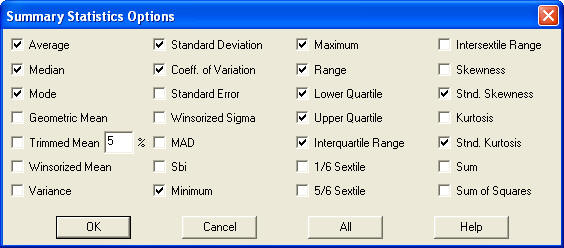
Summary Statistics table to maximize it and then press Pane
Options to display a list of other statistics that can be calculated:
. For example, double-click on the
Summary Statistics table to maximize it and then press Pane
Options to display a list of other statistics that can be calculated:
Click on several additional checkboxes and press OK to modify the Summary Statistics table. In some procedures, the Analysis Options button
will also be available. The options on that button apply to all tables and graphs in the analysis window, not just to the current pane.
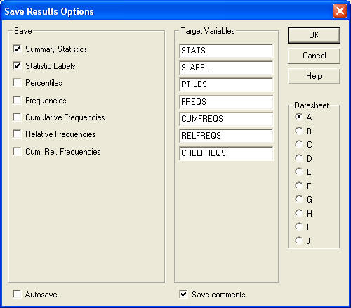
Place checkmarks next to Summary Statistics and Statistic Labels. Under Datasheet, select the radio button labeled A.
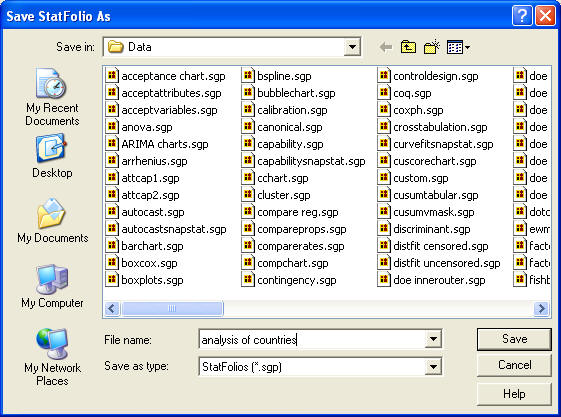
Note that the analysis is saved in a separate file apart from the data. Files that save desired analyses are called StatFolios and have the file extension .sgp. These files contain a definition of the analyses to be performed and a pointer to the file containing the data. More than one StatFolio may analyze data in the same data file. When asked whether you wish to save the data in datasheet A, reply No unless you want to save the calculated statistics.
When you run STATGRAPHICS at a later date, you can select File - Open - Open StatFolio and reload the StatFolio that you saved. When you do, the StatFolio will automatically load the data file that it points to and reexecute the saved statistical analyses on that data. If the data file has been modified since the StatFolio was last saved, the statistics will be different. StatFolios are the primary method for saving analyses that you wish to repeat often, since they automatically recalculate the selected statistics and graphs when they are reloaded.