|
The late Prof. John Tukey
had a major impact on statistical data analysis. In his
classic book entitled Exploratory Data Analysis, he
introduced many techniques for discovering unique features
contained in data. STATGRAPHICS Centurion contains several
of his procedures, plus other methods designed to help
extract information:
1.
Box-and-Whisker Plots -
five-number summaries of data samples, with optional
indicators for outside points.
2.
Stem-and-Leaf Displays -
data tabulation created by building a graphic from the
numeric values.
3.
Median Polish of Two-Way Tables
- a technique for discovering a common type of pattern
in two-way tables.
4.
Resistant Method for Fitting a
Straight Line - alternative method for fitting a
straight line which is resistant to the potential
presence of outliers.
5.
Nonlinear Smoothers for Time Series
Data - resistant smoothers based on running
medians.
6.
Rootograms - similar to
histograms but based on the square roots of class
frequencies.
7.
Bubble Charts - coded X-Y
scatterplots where the symbol size represents the value
of an additional quantitative variable.
8.
Radar/Spider Plots - technique
for comparing several samples of multivariate data.
9.
Scatterplot Matrices -
organized arrays of 2-variable scatterplots.
10.
Coded Maps - maps in which states
are color-coded according to the value of a selected
variable.
Box-and-Whisker Plots
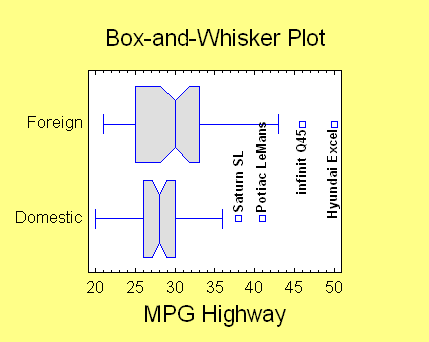
A box-and-whisker plot is
a schematic diagram that displays a five number summary of a
data set based on the: minimum, lower quartile, median,
upper quartile, and maximum. It is drawn with a central box
that covers the middle half of the data values, a line at
the median, and whiskers out to the most extreme values
(unless values appear to be far away from the center, in
which case they are shown as separate outside points.)
If desired, notches can be added to the boxes to display the
uncertainty in the location of the true population medians.
Stem-and-Leaf Displays
Tukey's stem-and-leaf
display illustrates the distribution of the data values in a
sample by using the leading digits from each data value to
create stems and the following digits to create leaves. The
digits to the right of the vertical line each represent one
observation. Any unusual outside points are shown on
special HI and LO stems.
|
Stem-and-Leaf Display for Temperature: unit = 0.1
1|2 represents 1.2
LO|96.3 96.4
2 96|
6 96|7789
19 97|0111222344444
40 97|556666777888888899999
(38) 98|00000000000111222222222233333444444444
52 98|555666666666677777777888888888899
19 99|000001112223344
4 99|59
2 100|0
HI|100.8 |
Median Polish of Two-Way Tables
The Median Polish
procedure constructs a model for the data in a two-way table
by sweeping out column and row medians. The resulting model
for the data consists of a typical value common to all cells
in the table, plus specific row and column effects.
Polished Table
Sweeping 3 times.
|
Cause |
None |
Grams 1_14 |
Grams 15_24 |
Grams 25 |
Row effect |
|
Lung cancer |
-0.5 |
-0.2025 |
0.2 |
0.86 |
0.1175 |
|
Upper resp. cancer |
0.0 |
0.0275 |
0.0 |
-0.02 |
-0.4525 |
|
Stomach cancer |
0.24 |
0.0875 |
-0.16 |
-0.09 |
-0.2825 |
|
Colon cancer |
0.0025 |
0.0 |
-0.1575 |
0.0725 |
-0.015 |
|
Prostrate caner |
0.405 |
0.0125 |
-0.015 |
-0.035 |
-0.3075 |
|
Other cancer |
-0.015 |
-0.0375 |
0.015 |
0.135 |
0.2025 |
|
TB |
-0.06 |
-0.0025 |
0.03 |
0.0 |
-0.3925 |
|
Bronchitis |
-0.125 |
-0.0575 |
0.055 |
0.245 |
-0.2075 |
|
Other respitory |
0.24 |
-0.0025 |
0.0 |
-0.28 |
-0.0025 |
|
Thrombosis |
-0.305 |
0.0125 |
-0.015 |
1.235 |
4.073 |
|
Cardiovascular |
0.0925 |
-0.09 |
0.2425 |
-0.1175 |
1.685 |
|
Hemorrhage |
0.0875 |
-0.085 |
-0.1525 |
0.1775 |
1.47 |
|
Ulcer |
-0.0175 |
0.02 |
0.0525 |
-0.0275 |
-0.435 |
|
Violence |
-0.125 |
0.1725 |
-0.185 |
0.125 |
0.0925 |
|
Other |
0.035 |
0.2925 |
-0.035 |
-0.075 |
0.9625 |
|
Column effect |
-0.09375 |
0.00875 |
-0.00375 |
0.1362 |
0.5462 |
Resistant Methods for Fitting a
Straight Line
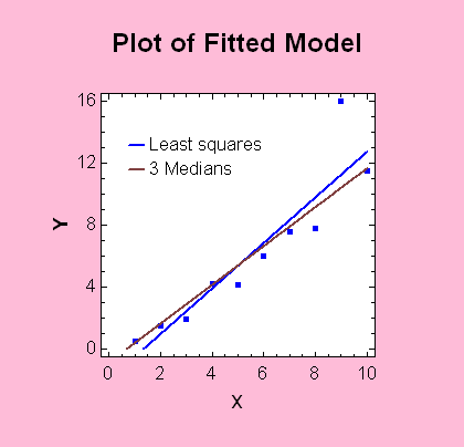
When fitting a straight
line, outliers can have a big impact on the fit. Tukey
devised a fitting method that would be more resistant to
their presence. In his method, the data are divided into
three groups and the fitted line is determined from the
group medians.
Nonlinear Smoothers for Time Series Data
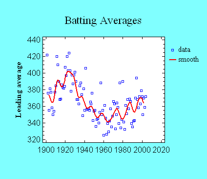
Tukey's resistant
nonlinear smoothers are very useful for displaying the trend
in noisy time series data. In the Time Series Smoothing
procedure, the smoothers are often used as preprocessors
before application of a weighted moving average.
Rootograms
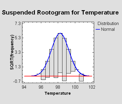
When assessing how
closely a probability distribution matches a sample of data,
standard histograms suffer from the fact that the longer
bars are subject to greater sampling variability than the
shorter bars. By plotting the square roots of the
frequencies rather than the frequencies themselves, it is
easier to see where any significant discrepancies are
occurring. The visual comparison can be made even easier by
suspending the bars from the curve, so that deviations
between observed and expected frequencies can be judged by
comparing the bars to a horizontal rather than a curved
line.
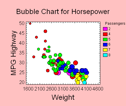
Bubble Charts
A bubble chart can be
used to display four variables simultaneously: one on each
of the X and Y axes, one defining the size of the bubbles,
and one defining the colors.
Radar/Spider Plots
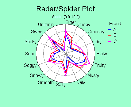
When a relatively small
number of samples need to be compared and the number of
variables is large, a radar or spider plot can be very
effective. The magnitude of each variable is shown along one
of the spokes.
Scatterplot Matrices
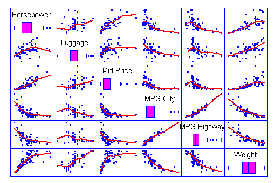
A great way to display
multiple quantitative variables is by creating a scatterplot
matrix. Each cell of the matrix contains a plot for a
selected pair of variables. All plots in any given row have
the same variable on the Y axis, while all plots in a given
column have the same variable on the X axis. Adding a
smoother to each cell helps illustrate any relationships.
Coded Maps
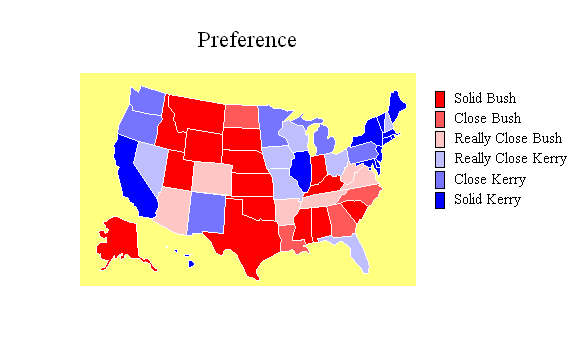
Special types of plots
can also be useful for displaying geographical data. The map
below illustrates the results of a poll taken several months
before the last U.S. presidential election.
|

